Creative Assignment #2 - "The Devil in Daytime"
- Michael Stellabotte
- Mar 29, 2020
- 7 min read
Updated: Apr 24, 2020
To the surprise of absolutely nobody, I am once again creating content that has to do with Daredevil on Netflix. Time and time again I reference this show and how much it inspires me, to the point where this will actually be the twelfth time I’ve based college course content on it. There was no doubt in my mind that I wanted to use the character’s subtext as a foundation for storytelling through this photo series assignment, as the context could further enhance the power each picture would have - and it certainly helped that I have action figures and diorama furniture to help me bring it to life. In the following five (technically six) shots that I captured, I will be analyzing the variables of viewpoint, framing, angle, lighting, and focus of each, and how they service Matt Murdock/Daredevil’s character - especially in the chronological continuity context of Marvel's Daredevil Season 2 and The Defenders.
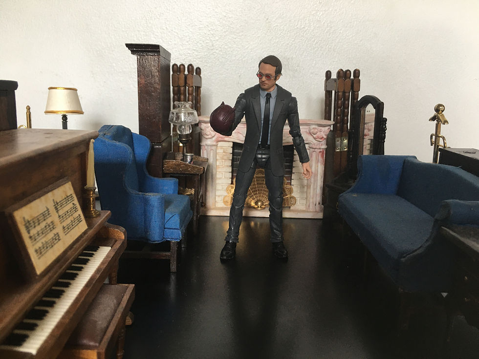
PHOTO 1: To be or not to be P1

To establish a baseline for the photo series, I wanted to capture Matt Murdock holding his Daredevil mask, in a pose that references the iconic Hamlet quote, “To be or not to be.” This is a dilemma that Matt encounters frequently throughout the series, as he wants to use his heightened senses and combat skills to make Hell’s Kitchen safer - especially when he cannot do so as an attorney at law. At the same time, he struggles with his own health and fears for his friends who may get hurt as a consequence of his actions. This is a struggle he bears mostly by himself alone. After Daredevil Season 2 and prior to The Defenders, Matt actually gives up the moniker of Daredevil and lives solely as Matt Murdock - so I decided this would be the background context for my photo series, grounded in the chronological continuity of the series. The viewpoint being a wide/long shot taken from far away emphasizes the distance between Matt and the audience in terms of conflict - most people probably cannot relate to the internal turmoil that he grapples with as both lawyer and vigilante simultaneously. Viewers merely get a voyeuristic glimpse into his mental battle within when he has his helmet in hand. The framing, despite the disconnect felt due to how much space there is between the audience and Matt, keeps the shot composition balanced - since Matt (for the most part) is able to keep both of his lives under control. There is a decent sense of the room, but since much of the furniture - which is built to entertain company - is empty, it adds to Matt’s hollow loneliness. The angle is an eye-level, horizontal wide shot - despite his powers and street-hero status, Matt is only human, just like the viewers. The straightforward shot proves it. The lighting is authentic sunshine from my window (something I rarely do for figure photos), which adds a sense of grounded realism to what amounts to a toy and dollhouse set picture. It is somewhat low-key/high contrast, as Matt’s shadow can clearly be seen on the floor, and some of the furniture is obscured by the dark - this is rather fitting with the lighting style of the official series. Lastly, the focus/depth of field is even across the frame, as the furniture’s emptiness is supposed to be taken into consideration after looking at Matt. He is clearly the main attraction, but his surroundings further establish the point of the photo. Despite the shifts in positions for both Matt and the camera, this thematic idea remains consistent across my photo series.
PHOTO 2: To be or not to be P2

The pose and placement of Matt remains the same for this shot, but the camera is maneuvered into a much closer and more dynamic position. The viewpoint is now from the floor, with less space between the viewer and Matt. Much of the room is absent in this medium-wide shot, isolating Matt and capturing his facial expression (which does not change since he is a figure, but definitely services the serious nature of the shot). The framing barely keeps key set pieces contained within it, and separates Matt from the furniture behind him. His proximity to the camera by comparison somewhat throws off the balance in the frame, but not to a severe degree. The angle looks up at Matt from a lower perspective, taken partially to the side of him - indicating that his struggle goes above that of most people’s, yet people respect the higher power that he has as both a lawyer and as Daredevil. The lighting is still even across the frame, with a shelf and the helmet slightly reflecting the sunshine - nothing is truly obscured by shadow, meaning that there is nowhere for anything to hide. Lastly, while the focus/depth of field is still consistent throughout, there is greater clarity on Matt’s face and the helmet, which grabs the attention above all else in view.
PHOTO 3: Masking the problem P1

In this new pose for Matt, I decided to progress the story being told through the photo series, by having him distract himself from continuing to dwell on his devil-problem - in The Defenders TV miniseries and the comics, Matt learns he can play the piano with ease and without lessons as a byproduct of his heightened senses, so I decided to use that as inspiration. However, despite maintaining the same pose, the different camera vantage points tell different stories. The viewpoint is fairly close to Matt, as if the camera were mounted to a low, imaginary ceiling. The piano and companion pieces, the mask, and Matt, are all that can be seen in the room through this aerial medium-wide shot. The framing is somewhat off balance, as Matt and the piano are on a (very) slight angle, but Matt, the mask, and the candles establish a diamond shape that counteracts it. Clearly Matt is focused on playing the piano to ignore the mask, which he placed on the very top of the piano just within his reach - both his mask and person pushing the top and bottom edges of the frame, with the piano separating them, emphasizes the divide between his two lives, and the mask being turned away from him shows how he is not facing the problem, but turning away from it. The angle being aerial is meant to belittle Matt, to imply that his choice in not addressing his issue is looked down upon. Viewers cannot see his face because he is not willing to face his problem. The lighting is mostly even from the sunshine, but the right half of the frame is slightly darker than the more exposed left half - which ties in well to his split identity. The focus/depth of field is once again consistent, since the key elements of the shot all need to be seen. The piano (and Matt’s hands on the keys) are the highlight, followed by Matt himself, and then the mask being barely kept in view. Focusing on any one of these details without the others makes the image message incomplete.
PHOTO 4: Masking the problem P2

The pose and placement of this shot was not altered in any way from the aerial shot - and it showcases something the previous photo could not. Matt, despite appearing as though he was successfully avoiding his Daredevil dilemma in the aerial view, is hesitating to even touch the keys - this camera position indicates that he is unable to bring himself to play away the pain. The viewpoint is taken fairly close to the subject in a medium wide shot, on even level with Matt himself. The mask is hardly in view because the piano obscures much of it. A better sense of the room is given because of hints of the other furniture appearing in spots of the background, but Matt, the mask, and the piano are once again the key elements. The framing is a little unbalanced because of the brown wood of the piano being the dominant color in the frame, contrasted by Matt’s gray suit - but the shot’s composition is level and evenly framed. The angle is not dutch/tilted because this is reality undistorted, even if the piano and Matt are positioned on a slight angle to bring Matt slightly closer to the viewer, and push the mask further back in the frame - symbolizing how Matt is failing to push it out of sight, out of mind. The lighting is fairly even, obscuring the piano in subtle shadow and highlighting the sheen of the mask - keeping a small spotlight on the issue Matt can’t ignore. Matt’s profile is in no way overshadowed because he too is still in the limelight of his plight. The focus keeps Matt’s face, hands, mask, and the piano in clear detail, leaving the unimportant background elements blurred, since those are all the viewer needs to understand what is happening.
PHOTO 5: Man in the Mirror

To bring the photo series to a close, I thought an individual photo capturing the literal mirror reflection would be a poetic way to express that he and Daredevil are both who he is inside (which is a neat little nod to Mulan). Even though the mask is nowhere to be seen in this photo, the embodiment of himself as Daredevil behind his actual body more than establishes that Daredevil will always be behind the Matt Murdock facade. The viewpoint is fully vertical, in an over the shoulder shot. The camera is close to Matt’s body, but the mirror (which is the key factor in the shot) is much further away. The sense of the room is only kept to the immediate surroundings. The framing is unbalanced because of how much visual weight Matt’s body has compared to everything else in frame, and how visually significant the mirror reflection is to understanding the story. The angle of the photo is straight on, even though Matt and the mirror are positioned on slight angles to make the image work. The lighting is a lot more low-key/high contrast here than in the majority of the photos, as the limited sunshine keeps Matt and the Daredevil reflection evenly lit, while much of the other furniture is cast in darker tones. The focus is sharp on the mirror reflection, blurring out Matt and the foreground elements and obscuring much of the irrelevant background ones, too. Daredevil and Matt are in it together - that is the one takeaway I hoped to emphasize throughout the photo series.


Comments